How to set up a Dropdown Menu for a Microsite
| If you don’t need to understand what’s going on, there is a shortcut: Just look at the commits in this PR (preview) |
The microsite generated by docToolchain groups your documentation along two axes:
the top menu and the left sidebar.
The top menu lists several menu items that each correspond to a different asciidoc page.
And each page comprises several chapters that you can navigate in the left sidebar.
If you want to group several pages you need an intermediary axis.
This axis can be realized with a dropdown menu.
There is no syntax within docToolchain to create a dropdown and assign (several) pages to menu items,
but we can tweak the html generation to create a dropdown for us.
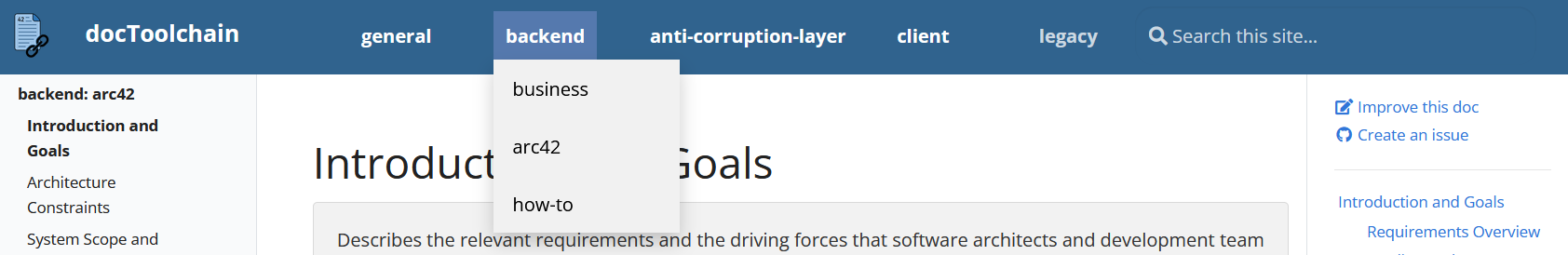
The result will look like this:
In the following we will use this terminology:
- menu item
-
Entries (or their String values) on the blue top menu bar (e.g. 'backend')
- dropdown item
-
Entries in a dropdown list, e.g. 'business', 'arc42', 'how-to' in the picture above
Folder Structure
The folders are arranged as usual: one folder per page.
We use prefixes (e.g. general_) to group pages that should end up in the same dropdown,
but this is not technically required, it just helps us to stay on top of things.
.
├── docToolchainConfig.groovy
├── dtcw
└── src
   └── docs
       ├── general_arc42
       │   ├── page1.adoc
       │   ...
       ├── general_business
       ├── general_how_to
       ├── backend_arc42
       ├── backend_business
       ├── backend_how_to
       ...
Markers
By default, the menu field in docToolchainConfig.groovy maps folder names to item names.
It also implicitly encodes
-
the order in which menu items are displayed
-
the actual value that is displayed in the top menu
Here, it will additionally encode
-
the menu entry a page belongs to
-
the order of a page within a dropdown
In order to accomplish that, we’ll put both the menu item and the dropdown item in every right side value.
The format for that is "<menu item name>: <dropdown item name>".
If a value does not contain ": " it will be interpreted as a regular menu item linked to one page.
This means that your menu (or dropdown) items cannot contain ": " in their name.
If you need ": " as part of the menu or dropdown item, you can use a different separator.
|
Look at the following example. The first three entries will create a menu item "general" with three dropdown items "arc42", "business" and "how-to" (in that order). The last entry "blog" will create a regular menu item with no dropdown.
    menu = [
            general_arc42:    'general: arc42',
            general_business: 'general: business',
            general_how_to:   'general: how-to',
            backend_arc42:    'backend: arc42',
            backend_business: 'backend: business',
            backend_how_to:   'backend: how-to',
            // ...
            blog:   'blog'
    ]
Menu Generation
To make docToolchain create the dropdown for us, we need to apply some changes to the default theme.
So, if not done already, we need to download the site folder with dtcw copyThemes.
default menu generation
<%
        content.newEntries.each { entry ->
%>
            <li class="nav-item mr-4 mb-2 mb-lg-0">
                <a class="nav-link ${entry.isActive}" href="${entry.href}"><span>${entry.title}</span></a>
            </li>
<%
        }
%>
In the example above <% … %> are used to embed groovy code into pages that are otherwise html.
Here a for-each loop is embedded to generate a list item element for every element in content.newEntries.
The content.newEntries field has the information from the menu field where earlier we added the information about which menu item each page should go under.
Now we need to extract the information about which dropdowns there are and which pages go where.
First, we’ll add some imports that we’ll need later.
    import static java.util.stream.Collectors.groupingBy
    import static java.util.stream.Collectors.mapping
    import static java.util.stream.Collectors.toList
Then, we’ll assert that our assumption still holds: content.newEntries is an ArrayList of LinkedHashMap s.
    assert content.newEntries instanceof java.util.ArrayList
    assert (content.newEntries.size() == 0) || content.newEntries[0] instanceof java.util.LinkedHashMap
After verifying the type of the input, let’s transform it to a class that we define, Item.
Having their definition in view will make it easier to work with them later on.
We’ll also define a transformation from a LinkedHashMap to our Item that drops the menu item from combined titles where we had added them before.
    //a custom class for dropdown items
    class Item {
        boolean isActive
        String href
        String title
        Item(isActive, href, title) {
            this.isActive = isActive
            this.href = href
            this.title = title
        }
    };

    //Transform a LinkedHashMap to an Item.
    //if the title is a combination of menu item and dropdown item, drop the menu item.
    def transform(e) {
        var title = e.title.contains(": ")
                  ? e.title.split(": ")[1]
                  : e.title
        new Item(e.isActive, e.href, title)
}| There are some newer groovy (server pages) features around like <g:each …> elements and records. I could not make them work[1] and ended up using the old concepts. If you find a way to apply them feel free to verify it by building on this PR and update this tutorial! |
In order to group pages by menu item, we need to define a key function. The key function should always return the menu item. So, from a combined title, just the menu item should be returned and the dropdown item be dropped. And from a regular item the whole title should be returned. But we still want to preserve the information about whether to create a dropdown. Thus, we add a marker prefix in front of the key for dropdown items. (Instead of the marker prefix we could also just interpret map entries where the value is a one element list as not-a-dropdown. But then we couldn’t support dropdowns with exactly one element and somebody might want that.)
    MARKER_DROPDOWN = "dropdownmenuitem_"

    //get the menu item from a combined title. If there is no separator get the full title.
    def getMenuItem(e) {
        e.title.contains(": ")
                  ? MARKER_DROPDOWN + e.title.split(": ")[0]
                  :                   e.title
    }
Now we can group the pages to a map where the key is the menu item (plus an indicator prefix iff // == "if and only if"
a dropdown should be created) and the value is a list of Items.
    var LinkedHashMap<String, List<Item>> itemGroups
    itemGroups = content.newEntries.stream()
                                   .collect(
                                       groupingBy(
                                           this::getMenuItem,
                                           LinkedHashMap::new,
                                           mapping(this::transform, toList())
                                       )
                                   )
After enriching the original content.newEntries map with dropdown information and making that information accessible,
we can now generate the menu from it.
So we’ll add an if to the existing for-each loop, that distinguishes between regular menu items and those with a dropdown.
For a dropdown, we place a button (so one can click on it and have the dropdown items displayed) and a div with all the dropdown items.
For a regular menu item, everything stays the same.
    itemGroups.each { key, val ->
        if (key.startsWith(MARKER_DROPDOWN)) {
            //dropdown
%>
            <li class="nav-item mr-4 mb-2 mb-lg-0">
                <div class="dropdown">
                    <button class="dropbtn"><span>${key.minus(MARKER_DROPDOWN)}</span></button>
                    <div class="dropdown-content">
<%
            val.each { item ->
%>
                        <a href="${item.href}">${item.title}</a>
<%
            }
%>
                    </div>
                </div>
            </li>
<%
        } else {
            //there is no dropdown, take the only element
            entry = val.get(0)
%>
            <li class="nav-item mr-4 mb-2 mb-lg-0">
                <a class="nav-link ${entry.isActive}" href="${entry.href}"><span>${entry.title}</span></a>
            </li>
<%
        }
    }
%>
Now we have all the structural information, and if we generate a microsite now, we can see all the dropdown items.
But, we only want to see them on a mouse over, so we’ll have to add some CSS as well.
For that we’ll just add another style element to header.gsp.
For basic functionality, we just need to set display to none unless there is a mouseover.
    <!-- dropdown menu -->
    <style>

         /* Dropdown Content (Hidden by Default) */
         .dropdown-content {
           display: none;
           position: absolute;
           background-color: #f1f1f1;
           min-width: 160px;
           box-shadow: 0px 8px 16px 0px rgba(0,0,0,0.2);
           z-index: 1;
         }

         /* Show the dropdown menu on hover */
         .dropdown:hover .dropdown-content {display: block;}
Now all that’s left is some styling to seamlessly integrate the dropdown to the rest of the page.
         /* The container <div> - needed to position the dropdown content */
         .dropdown {
           position: relative;
           display: inline-block;
         }

         /* Dropdown Button */
         .dropbtn {
           background-color: #30638E;
           color: white;
           padding: 10px;
           font-size: 16px;
           border: none;
         }

         /* Links inside the dropdown */
         .dropdown-content a {
           color: black;
           padding: 12px 16px;
           text-decoration: none;
           display: block;
         }

         /* analogous to the `.td-navbar .nav-link` block*/
         .td-navbar .dropbtn {
           text-transform:none;
           font-weight:700;
         }

         /* Change color of dropdown links on hover */
         .dropdown-content a:hover {background-color: #ddd;}

         /* Change the background color of the dropdown button when the dropdown content is shown */
         .dropdown:hover .dropbtn {background-color: #5579ae;}

    </style>
With that, we have added a dropdown to the top menu and didn’t have to add any new features to docToolchain.
Caveats
The fact that there is no structural support[2] for dropdowns in docToolchain is noticeable in some places.
-
The folder structure (in
docs) is flat, folders of dropdown and menu items are on the same level. -
The URLs in turn are not as one might expect
…/menu_item/dropdown_item/pagebut…/menu_item_dropdown_item/page. -
For regular pages the top entry in the left sidebar is the name of the menu item, but for pages of dropdowns the top entry on the left is the value specified in
menu.gspin the fieldmenu:<menu item>: <dropdown item>. (This behaviour can in all likelihood be changed by adding a command in the right.gspfile)
These points are probably not an issue for most people, but for transparency they are listed here.
1. 1)
<g:xy> elements are not recognized, I guess the 'g' namespace isn’t. 2a) record Point(int x, int y, String color) { } gives Unexpected input: '(' 2b) @RecordType class gives SimpleTemplateScript … unable to resolve annotation RecordType
2. we are basically telling docToolchain to treat some menu items, which we labeled as dropdown items, differently from the rest.
Feedback
Was this page helpful?
Glad to hear it! Please tell us how we can improve.
Sorry to hear that. Please tell us how we can improve.